This Chagrin Falls Vacation Home Pops With Color and Texture
by Rita Kueber | Feb. 24, 2022 | 1:00 PM

Paul Sabota
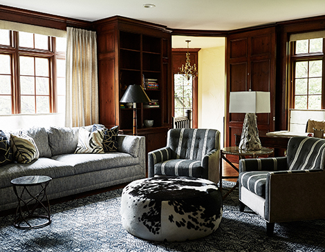
The interior of this Chagrin Falls Tudor pops with color, comfort and unique furnishings, thanks to inventive design work and owners seeking a cheerful vibe with eclectic touches at every turn. Though they had long admired the house, once inside, the owners felt the traditional surfaces and details were dated and dark. Thinking new window treatments might be the remedy, but uncertain, they discovered Linda Mauck Smith, principal of Blulens Design.

The owners wanted a home that didn’t look “cookie-cutter” in any way. Rather, they desired that every room offer a bit of a surprise — and tasked Smith with delivering interesting decor that engages everyone who sets foot in the space.
The owners wanted to avoid the typical Tudor palette heavy with red, gold and rust tones. They also preferred to ditch conventional furnishings. “We started over,” Smith says. “We took the time to find fun in the living areas and seek out anything unusual. Every piece had to be light, bright, textured and make you smile.”

Using her go-to suppliers, Smith searched for furniture outside the Cleveland market, while incorporating some pieces the owners already had. The process was deliberate and a bit time-consuming as they decided on custom work, selecting fabrics for each piece and sometimes using several coordinating fabrics on just one piece of furniture.
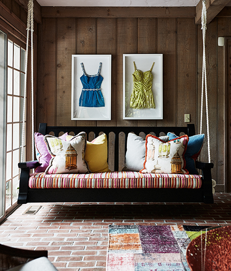
Previously, the sunroom served as a passageway from house to outdoor pool and patio, but Smith saw the opportunity to create a unique space to relax. A large wooden porch swing was brought indoors and works as a daybed, while the wicker chairs from Baker Furniture create extra seating.
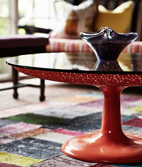
The bright orange table from Lexington paired well with the owners’ multicolored rug. As an added eclectic touch, Smith found an artist who created wall art from vintage swimsuits and added those over the swing and its colorful, deliberately mismatched pillows. “You turn every corner and see something unusual but not odd,” Smith says.

Even sometimes-overlooked spaces, like a stairway landing, got a makeover. Smith added classic white leather Barcelona chairs with custom pillows to achieve a distinctive silhouette. These were paired with textured drapes, an interesting side table and a compelling glass sculpture, all in complementary neutrals but made fascinating with the interplay of light and smoky shadow. This nook overlooks the front yard and invites residents and visitors alike to enjoy a cup of coffee, a good book or engaging conversation.
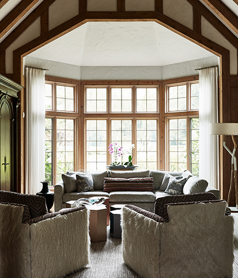
The biggest challenge was finding the best use of the expansive space. “On plan, the rooms are very large,” Smith says. “We wanted each one to have its own character, furniture and layout and not be repetitive. We also wanted a lot of natural light.”

The result is that every room has a different feel, but they all blend well together. But Smith went a step further, considering where to place furniture in each room to deliver the best view.
“The owners have told me they ask each other, ‘Which room should we sit in tonight?’ because each room is inviting in its own unique way,” Smith says. “Everything is custom, but nothing feels so priceless that you can’t use it.”
Get inspired by our 2022 Home Issue with these decorating tips, local home spotlights and more.
Trending
-
1
-
2
-
3
-
4
-
5


