Cocktail-Inspired Hues For Your Summer Interior Design
by Arbela Capas | Jun. 5, 2019 | 12:00 PM

Lauren Cox
Whether you like your cocktails shaken or stirred, there’s a paint color just for you. Sherwin-Williams’ line of summer colors, which are inspired by some of our favorite mixed drinks, can add some sizzle to your home. Hues such as Carnival, a deep orange that changes colors depending on how much light hits it, is reminiscent of the refreshing Aperol Spritz, an Italian wine cocktail typically garnished with a fresh orange.
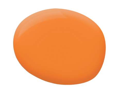
“I think we’ve been seeing more and more of this whole ‘maximalism’ feel,” says Emily Kantz, an interior designer with the color marketing and design team at Sherwin-Williams.
Use the bold color as the main statement in a room, then add greenery to create a gorgeous contrast between the orange and natural hues. “This color pairs well with a lot of plants,” says Kantz. For a subtler approach, she also recommends letting this color make an impact in small doses. “You could use it as an accent wall or as a painted furniture piece.”
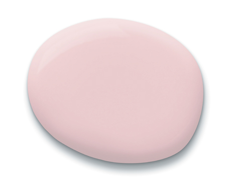
Rosy Outlook: Rose is having a moment, but the vintage hue also looks great in a home with a modern decor approach. “It’s still very appealing and it’s very sophisticated. I think you can pair this with more modern pieces and more gray tones,” says Kantz. “If you have a gray carpet or wood flooring, this pink would look so gorgeous with it.”
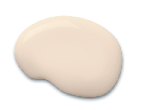
Champagne: Turn here for a versatile base color that isn’t white or beige. This color, inspired by a French 75, can be used on various areas throughout the home, creating a neutral finish while adding brightness to each wall. “If someone who may not necessarily want to use grays, if those might be a little too cold for them,” says Kantz, “this Champagne is this really nice, pretty, creamy neutral.”
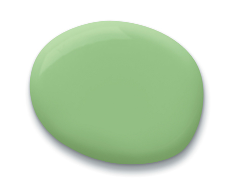
Picnic: The spice and refreshing zing of a jalapeno margarita are perfectly represented by this green color. “It kind of makes you think of a tropical getaway, but it also just works all year-round,” she says.
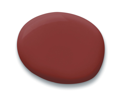
Salute: There’s nothing more carefree than lounging back with a glass of sangria. Think of this mood when you use Salute, a deep burgundy shade that will add the right amount of coziness. “If you want a little nook where you can just sit back and relax with a book or something, this is going to be that color,” she says.


