This Transitional-Style Home Boasts Modern Elegance And Traditional Charm
by Rachel Scully | Jun. 29, 2021 | 11:00 AM

Courtesy W Design
Dark hardwood lines the floors in the hallway leading to the stairs like rich chocolate in this Hunting Valley home. Imported from Naples, Florida, the floor is one of the many minimalistic, yet striking elements throughout this house, designed and styled by W Design’s project manager Brittany Green. Lighter rustic wood paneling borders the ceiling, emitting a traditional, homey feel, while the white walls and symmetrical lines of the light fixture adds a modern edge. A large abstract dotted painting hangs above the rustic pine console, creating an unexpected pop of light in contrast to the dark-stained floor. “I don’t think in the traditional style of home you would’ve necessarily expected to see that fun, just kind of whimsical piece of art,” says Green.
While it looks simple at first, every layer of this home inspires a different feel. Blending traditional and updated elements, this transitional style is created by balancing white, modern color palettes with natural wooden textures. Designed alongside architect Chuck Fazio, designer Brittany Green aimed to create a space full of dimension without losing any traditional details along the way. “The fun thing about design is there’s no rules, so to speak,” she says. “Obviously, when it comes to proportion and sizes, yes, but the styles and mixing different elements of design, you kind of just have fun with it and work with what you have.”

Hidden Details
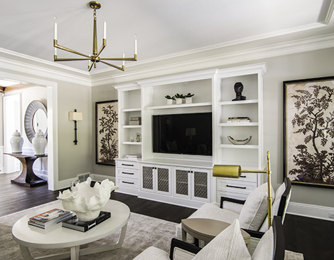
The longer you look, the more detail you’ll see in this formal living room. Layering design elements, unique accessories and textures throughout the home were key in creating dimension and depth. Take the elegant black marble sculpture on the shelf contrasting the golden metal lamp or the way the abstract ceramic bowl on the coffee table plays with the leafy design of the wall art pieces. “A lot of times we’ll mix some modern elements with traditional, bringing in a statement [piece] and kind of again layering all of those looks together,” she says.

Fixed Statements
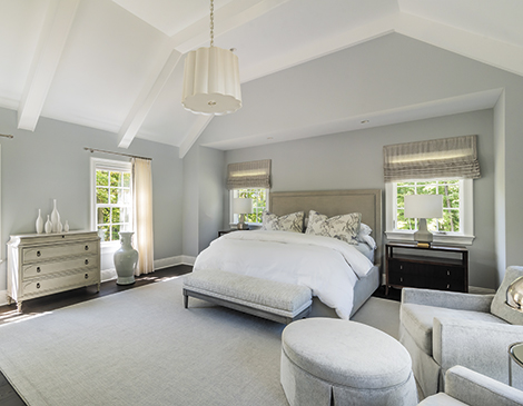
Natural light pours into the bedroom, highlighting the bright neutral colors, high vaulted ceiling and minimal decor in the space. Although the color scheme is simple, the ivory-colored lighting fixture makes a statement with its abstract design, while the neutral colored window treatments translate the sun perfectly into the room. “[The owner] definitely wanted that feminine feel in this room without it being too feminine and this definitely brings that all together,” she says. “With the scalloped edges of the light fixture, it almost has like a flower look to it.”

Clean Slates
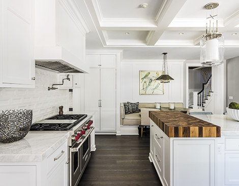
Cool whites and a refined, modern backsplash greet you as you enter this kitchen, while the dark wooden butcher’s block pulls your eyes forward. This large cutting board serves as a focal point of the kitchen with the contrasting wood tone against the marble countertop. “It’s actually something that a lot of clients desire to have,” Green says. “It’s just the workspace to do all your prep work in the kitchen. We like to keep it in that working triangle.” A breakfast nook with a built-in banquette sits against the other end of the kitchen, adding a cozy, yet practical element to the space.

Relaxed Setting
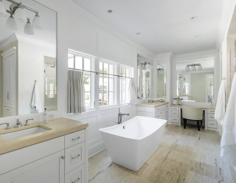
A serene at-home spa awaits. One end of the bathroom features a delicate vanity for getting ready, while a gentle lightwood finish adds even more warmth around the sink on the other side. But in the end, it’s all about the porcelain bathtub, which is both spacious and adds symmetry and balance to the room. “It is a focal point,” says Green. “Most clients that want a freestanding tub, they want it for the look. You do want to feature it a little bit, whether it’s at the end of the room, in the center or in this case, sandwiched kind of between two vanities and then across from the shower.”
Trending
-
1
-
2
-
3
-
4
-
5


