Get ahead of the weekend by signing up for our free weekly “In the CLE” email newsletter — your guide to fun throughout The Land.Click here to subscribe.
Children's Rooms Can Match Design and Duration
by Lynne Thompson | Mar. 28, 2023 | 12:00 PM
Courtesy Suzuran Photography
A room that actually grows with a child, eliminating costly and disruptive demands to redecorate and meshing with the rest of the home’s tasteful interiors.
It sounds like a magical place to anyone parenting a kid who proudly shows off his or her room to friends one day, then disgustedly dismisses it as “a baby’s room” the next. But Natalie Meyer of CNC Home & Design in Fairview Park and Linda Mauck Smith of Blulens Design in Shaker Heights create them on a regular basis. Their secret: producing an interior-design foundation that will accommodate years of updates.
“[Children] may be interested in a particular theme or a character one week,” Meyer observes. “And maybe a couple of months later, they’ve completely moved on to something else. This way, you’re able to add in those little touches. But they’re much less permanent, let’s just say, if their interests change or evolve.”
Meyer offers the example of the space she designed for a 3-year-old as a celebration of her move from the nursery — a room to be occupied by a new baby brother — to a big sister’s bedroom. She liked the color pink. Meyer interpreted that preference by painting three walls Benjamin Moore’s Warm Blush. The pastel, a shade more sophisticated and timeless than a bright counterpart, blends with the light grays, soft blues and whites in the traditional-meets-
modern-farmhouse decor Meyer had installed in the 1946 Fairview Park colonial. A fourth wall was painted white, then speckled with pink polka-dot temporary wall decals ordered from simpleshapes.com. Meyer stresses that the feature is not visible from the hallway.
“It’s almost an unexpected design surprise,” she says. “And because you don’t see that bold feature wall from the hallway, it helps tie the room in with the rest of the home’s aesthetic.”
She adds that when the child tires of it, the decals can be removed and the white wall easily repainted if necessary, perhaps in warm blush or a different color.
The girl’s parents invested in a clean-lined, classic dresser constructed of wood and painted a versatile white. Meyer notes that wood pieces are generally more durable and easier to touch up, repaint or restain. She gives the bed, which had been passed down through the family, and nightstand, which previously occupied a guest room, as evidence: Both were repurposed with white chalk paint to match the dresser. The nightstand’s taupe-painted frame complements a color found elsewhere in the house.
Meyer hung a white cellular shade under light-filtering pink panels at the window. “Swapping out a couple of curtain panels over the years is much easier than having to change an entire shade or window treatment,” she observes. She warmed the hardwood floor with a 5-by-7-foot polyester rug from Pottery Barn Kids, an addition that serves as a grounding piece by incorporating all the room’s colors in a traditional floral pattern.
“Adding a patterned or printed rug is another way to make a child’s room sustainable, especially if you choose a material such as a polyester or wool,” she explains. “It makes it a little easier to clean. And the printed or patterned design can also help conceal any spills or stains.”
A bedside lamp and pom-pom-studded bedspread in a fresh mint green, both from Target, balance the room’s pink sweetness, while the bedding reflects the girl’s interests. A pink tulle bed skirt reminiscent of a ballerina’s tutu from Macy’s serves as a subtle nod to her love of dance, an accent pillow punctuated by a unicorn from Pottery Barn Kids to her fascination with fairy tales and magic. Meyer created the requisite space for pursuing a favorite activity — in this case, reading — by hanging a sheer pink-and-white-ombre canopy tent from the ceiling with a Command-brand peel-and-stick hook next to a bookcase anchored to the wall for safety. The tent, from Target, can be repurposed as a canopy for the bed when the girl tires of crawling into it with a book or wants to make way for something else.
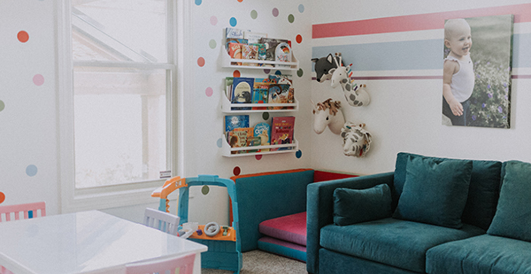
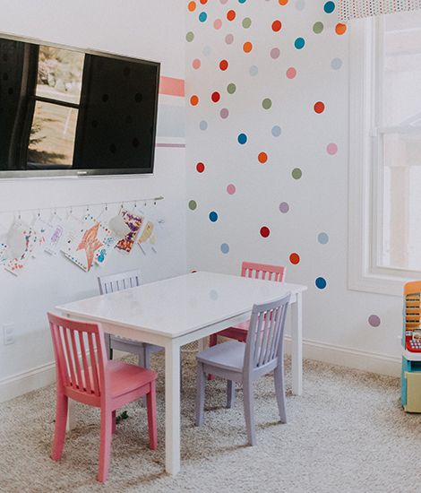
Smith employed a similar strategy in decorating a first-floor nursery for newborn twin girls — a feature that eliminated their parents’ daytime runs to a second-floor sleeping space — designed to morph into a playroom as the babies became toddlers who didn’t nap as frequently. Instead of simply painting each wall one of the bright colors found throughout the 3,000-square-foot traditional/transitional Strongsville home as the clients initially desired, she encouraged them to think of other ways to introduce those colors. The trio settled on painting the room white, then creating a multicolored feature wall with temporary polka-dot decals. Shades of red, blue and purple found in the decals were used to paint a racing stripe that continues around the other three walls.
“We came up with those three colors because we felt they were gender-neutral,” Smith says. “They knew they were going to have another child, hopefully. And we wanted it to be not just a girl’s playroom.”
The polka-dot design is repeated in a Romo-brand fabric that covers a window cornice board, the colors in child-sized chairs surrounding a white table from Pottery Barn Kids. The balance of furnishings was selected to transition with the space or pull double duty.
Smith envisioned the teal love seat, chosen to seat babysitters and visiting grandparents, being used by the twins while watching the flat-screen television when they’re older.
A little chair stationed between the sofa and bookcase actually is made of cushions that can be pulled apart for lounging on the floor or building a fort, while stuffed animal puppets hung overhead function as wall art when not in use.
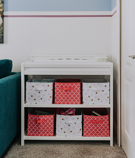
The changing table shelves were outfitted with bins to store smaller toys as well as baby supplies.
Additional storage is provided by a closet shelving system used for stashing dress-up clothes and accessories.
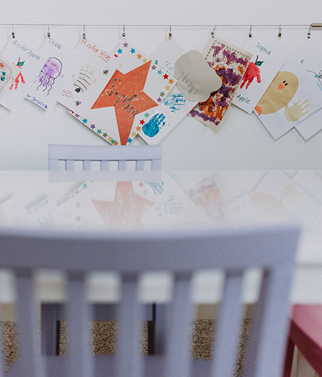
Smith put a full-length mirror on one wall. She points out a wall system near the table and chairs where they can display their drawings and paintings.
“I didn’t want to just put a bunch of framed pieces up that didn’t mean anything,” she says.
Meyer says that the little girl who moved into her pink bedroom as a 3-year-old still loves it as a 5-year-old. But she’s currently captivated by Disney’s Frozen movies. Smith reports that, five years later, the twins are still using the playroom, along with a younger brother who was born after the project was completed.
“Every child that comes in is excited,” she says. “It gives the right amount of energy for a child to want to go in and play. … It’s still just as good as it was day one.”
Get inspired for your next home project by digging in to the 2023 Cleveland Home Issue.
Trending
-
1
-
2
-
3
-
4
-
5

