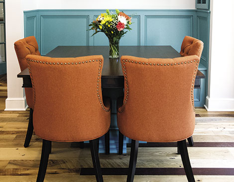
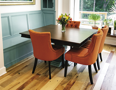
This newly remodeled kitchen pops with personality. Using the homeowner’s collection of Maya Green’s artwork as inspiration, Architectural Justice interior designer Merrie Guinther built the dining nook around the bold and vibrant colors of one of the oil paintings from the Ukrainian-born artist. “Those colors are so bright and vivid,” says Guinther. “You can’t help but smile when you see them.” Guinther created an inviting atmosphere that inspires connection from a splash of orange in the cushy chairs to the banquette painted a striking turquoise. The result is a spot that’s comfortable, happy and welcoming. “It’s just another space to bring the family together for meals instead of the bar,” Guinther says. “You can sit across from one another and it invokes conversation.”
Before the remodel, the kitchen was long and narrow. To increase flow and functionality, Guinther moved the staircase into the living area and used that space for a pantry. That move also allowed the kitchen to be set up as a galley kitchen with open space on both ends. Today, the kitchen is warm with touches of the homeowner’s personal style, such as the metalwork lantern lighting fixtures the client picked out herself. “[The client’s] personality really came out in the design,” Guinther says. “She wanted a place to wake up in the morning and start the day off on a positive vibe.”
Open Design
Tucked between the living room and the garage, this kitchen opens on both ends and draws the eye through the mudroom to the picture window — thanks in part to the turquoise pedestal base in the dining nook and the view from the window. “The doorway from the garage had a landing space for jackets and shoes, but the other end was open to this beautiful picture window that opened to the property,” Guinther says. “To see beautiful mature trees, the pond, it brings that nature in.”

Custom Counters
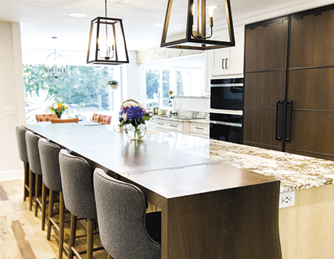
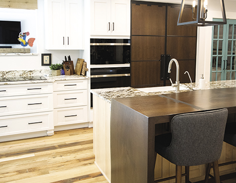
The centerpiece of the kitchen is the 175-inch island counter: a slab of Brazilian granite attached to solid walnut with waterfall edges falling to the floor. With the goal of creating consistency throughout the kitchen, instead of having the visible seams at the connection points, Guinther installed metal strapping in a dovetail design. “We brought that design element to the refrigerator panels and also to the apron of the custom dining table,” she says. “We’re bridging these elements together.”
Integrated Appliances
The dark walnut coloring extends to the panels of the integrated walnut refrigerator while the dishwasher and ice machine have a white wood cabinetry paneling. This contrast of materials creates an interesting visual display while also hiding the functional appliances, so much so that a house guest might think twice when searching for a snack. “Those are also integrated,” Guinther says. “So, again, you don’t know they’re there unless you’re looking for it.”
Cozy Seating
Whatever the occasion, the kitchen’s range of seating — bar stools, dining chairs and a bench — all were designed with comfort in mind. As opposed to typical hardwood chairs, the homeowner had her eyes on soft, cushioned seating for family and friends to feel at ease when they gather for meals together. “It’s a nice juxtaposition to all the hard surfaces in the kitchen,” Guinther says. “The cushion chairs add a soft finish.”

