Ever since they bought the place three years ago, Libby Palmieri’s clients had struggled to find a purpose for the sunroom of their 1927 Shaker Heights colonial. The space, actually two small rooms added by a previous owner, just didn’t look warm and inviting, despite an entire wall of windows. Mortared sandstone on the house’s former first-floor rear exterior, dark oak paneling on the adjoining walls, red brick around the fireplace and jade-green limestone pavers on the floor all contributed to the dissonance. “It’s, like, seas of this tile,” marvels Palmieri, owner of Solon interior design firm House of L. “That’s something you can’t quite ignore.”
The homeowners removed the wall between the two rooms and replaced the paneling with drywall. Palmieri then needed to incorporate the remaining disparate finishes with the new decor. “It’s almost wasteful to just take it out,” she says.
Painters covered the brick with the same white chosen for the once-paneled walls. One end was turned into an art studio, and Palmieri furnished the room with an eclectic mix of pieces in colors that complemented both the stone and the pavers. The result: A light, bright spot where the owners can enjoy views of the backyard — if not the elusive Northeast Ohio sun itself — until they can venture outside without winter coats.
 The Daybed
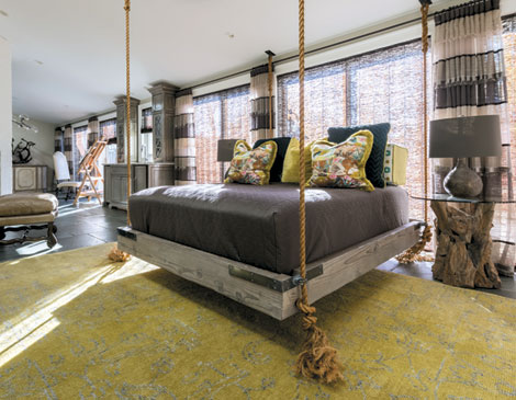
“The concept overall was bringing this foresty feel [into] the sunroom, bridging the outdoors to the inside of the home,” Palmieri explains. The recycled barn wood queen bed by California-based woodworker Ben Riddering, suspended from shored-up supports in the ceiling and flanked by Arteriors’ Nantucket tables with dried-teak-root bases, evokes a tree swing or hammock that urges you to plop down and relax.
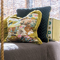 The Color Scheme
Dark reddish-brown veining in the limestone pavers provided inspiration for a palette that includes chestnut and light coral as well as citron and jade. “There’s a tendency to want to match what’s existing. Oh, there’s green floors. Let’s make the walls green, too!” Palmieri says. Instead, this palette offers a juxtaposition. “When you do a dynamic room, you want to create some tension in the space to give it that energy that draws you in the room.”
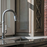 The Wet Bar
The custom built-in was added to provide easy access to drinks during warm weather use of the adjoining sandstone patio and pool. (The existing double-hung window between the twin cabinets opens for easy serving.) The bar and cabinets were painted in layers of taupe, silver and chocolate, then glazed in a high-gloss lacquer to add even more depth to the room. “Sometimes, if you have too many patterns, there’s too much to look at — there’s too much to try to absorb,” Palmieri says. “When you use texture, it becomes a more neutral and inviting space.”
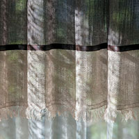 The Window Treatments
Palmieri hung Conrad woven raffia shades that, when lowered, filter the sun’s rays without totally blocking them out. Each pair of south-facing sliders is outfitted with draperies constructed of elaborate Sahco “Bosco” fabric — alternating panels of natural and chocolate linen in varying degrees of sheerness punctuated by faux leather banding and fringed metallic linen that draw attention from the floor. “I wanted to make sure that your eyes were looking at what they should be, which is out to the exterior,” she says.
Spice Up Your Spare Room With These Tips
Libby Palmieri added a swing bed to this 1927 Shaker Heights colonial sunroom.
at home
10:00 AM EST
April 19, 2018

