We can easily misunderstand the 1920s as one big Great Gatsby party. But really, the ‘20s were a time of great contrast — traditional vs. modern, men vs. women, Prohibition vs. rumrunners. As the old order was flung off with the whoosh of the flapper’s fringe, design shifted with it. “We see art going from in the early ‘20s, new interpretations of old styles to completely new forms, new materials, new techniques and everything new and abstract,” says Stephen Harrison, Cleveland Museum of Art curator of decorative art and design. The Jazz Age: American Style in the 1920s, on display at the museum through Jan. 14, bops through that evolution in American sensibility while showcasing more than 300 pieces, including Viktor Schreckengost’s famed Jazz Bowl and Cleveland fashions from Kent State University Museum and Western Reserve Historical Society. Here are four innovative items that capture the changing times.
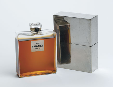
No. 5 Perfume Presentation, 1921
Restraint makes this piece remarkable. Instead of adorning a rounded bottle with the superfluous design elements of the era, Coco Chanel became one of the first to create an angular transparent molded glass bottle. (It still contains the original perfume.) Chanel paired it with an equally sleek stainless steel box that returns to the basics. “She’s trying to reference new materials being used in geometric furniture and design at the time,” Harrison says.
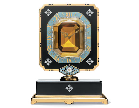
Mystery Clock with Single Axle, 1921
Decadence stays frozen in time with this lavish jewel-encrusted Cartier clock. “It was the height of luxury,” Harrison says. A clear disc rotates the hands in the citrine, creating the illusion that the hands float in space, while a pulley system works behind the ebonite gold and diamond-encrusted border to make it tick. “It represented the ingenuity and innovation that jewelers took to their craft,” he says.
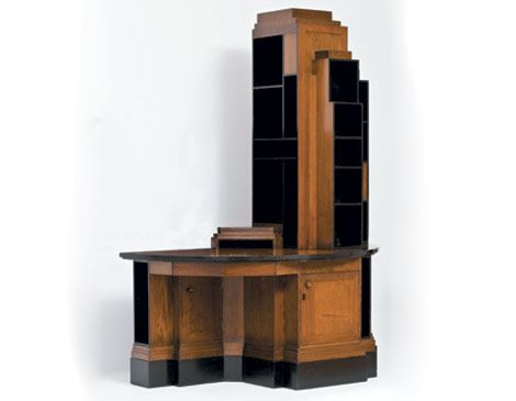
Skyscraper Bookcase Desk, 1928
As Paul Frankl was designing this line in 1926, the
Terminal Tower opened. Frankl mimics the emerging skyscrapers of the time with this building-like California redwood bookcase and desk, which evokes a tiered skyline with its stacked form. “Designers at the time, they took inspiration from the pulse and the soaring architecture of the city,” Harrison says.
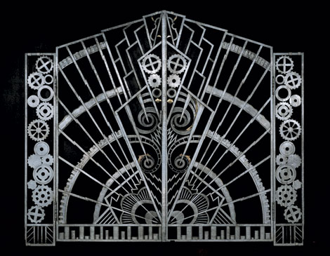
Pair of Gates from Chanin Building, 1928
This could be called the gateway to the future. While a product of the late ‘20s, these gates from the iconic New York City skyscraper gear up for the industrial ‘30s aesthetic with wrought iron and bronze cog and bolt elements. “It’s all about technology and celebrating the machine and the machine aesthetic,” says Harrison.

