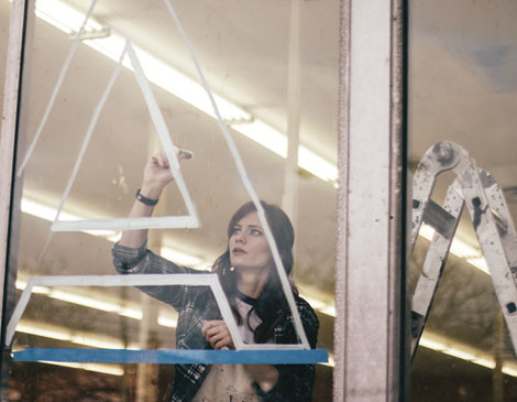
Where the rest of us might see a wrought iron streetlamp or printed wallpaper, Lisa Quine sees letters. The 27-year-old creative consultant and lettering artist finds inspiration for her typography from unlikely sources as she creates work for national clients such as Target, American Greetings and Harley-Davidson, plus local gems such as TownHall, the Cleveland Flea and an upcoming six-wall mural on the corner of Superior Avenue and East 21st Street.
“Whether I’m walking down the street or at the museum, there are opportunities for creativity everywhere,” says Quine. “I’m always looking to break through the clutter and find unique ways to be inspired.”
Quine put down her pen to talk local arts, building a social media following and designing for biker chicks.
On growing up in Cleveland: I grew up in Mentor and was so fortunate to have gone on grade school trips to the Cleveland Museum of Art. This city has always felt so art-centered, supportive and eclectic. I have found Victorian art influences in flea markets, and art nouveau items in coffee shops. It’s all here.
On lettering: I like fonts because they have the power to change the way you feel about words. The font used on stop signs and the fonts drawn on protest signs are very similar because they are working to do the same thing: “Look at this! It’s important!” But then the fonts on greeting cards can be the exact opposite. Condolence cards have fonts that can be soothing and beautiful to help the message feel even more comforting. Can you imagine if everything were in Helvetica? Grocery store aisles and movie titles would be super boring. I’m grateful that we have so much variety out there to make words that much more expressive.
On social media: I started on Instagram by posting my lettering lyrics from a Rilo Kiley song over type in an art psychology textbook I knew I was never going to read. I recently started following a woman in Sacramento who puts intricate Scandanavian patterns within letters. That’s pretty specific, but social media allows us to be connected. Now I can witness her art, which then has the potential to launch my work into different directions.
On working with Harley-Davidson: I never sat down and said, “I’m going to design letters for women who ride motorcycles,” but the relationship-building in this work helped me provide content for an audience with which Harley-Davidson was struggling.
On her Target coloring book: An agency on the West Coast randomly found me online and asked if I would be interested in doing a couple of test pages, which then quickly turned into a coloring book. They gave me a set of quotes with the instructions that the drawings be “intricate, fun and expressive.” To this day, people send me pictures of their finished drawings, and it makes me smile each and every time.
On her creative process: Sometimes I need to be alone and other times I get my energy from being around other people. A lot of people have gravitated toward technology, but I’m more analog. There’s something about a pen to paper that is so romantic. It is simple, soothing, and I never want to lose that connection.


