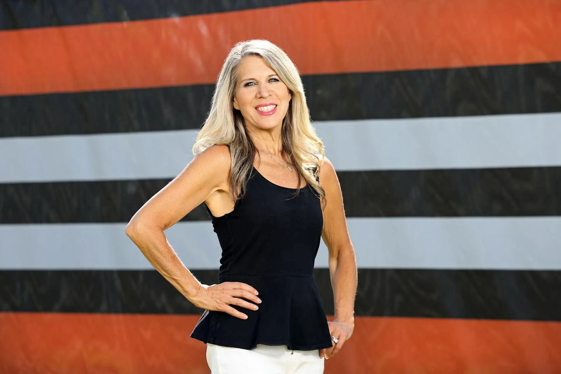
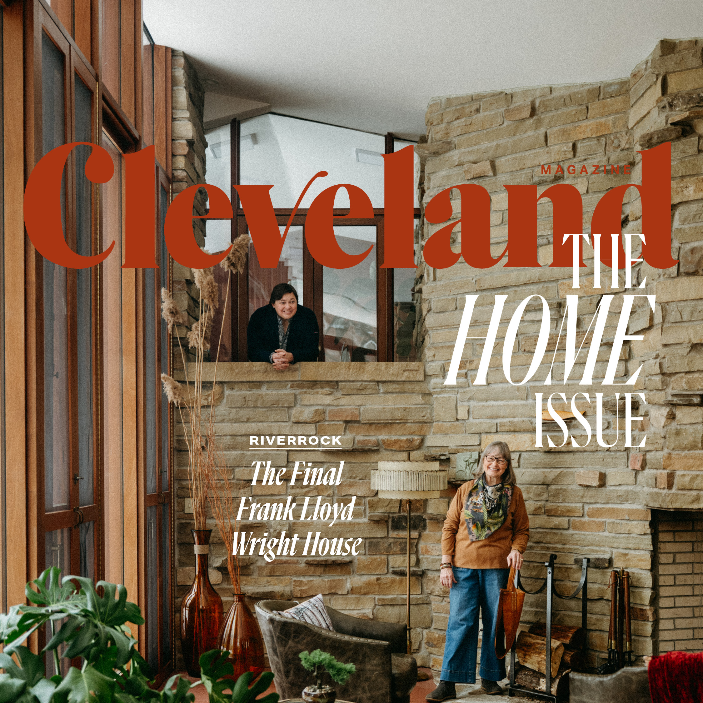
Cleveland Magazine Art Director Erin Stinard on the Magazine's Redesign
by Henry Palattella | Mar. 28, 2022 | 12:00 PM

Courtesy Erin Stinard
Things are about to look a little bit different here this month. For the first time in more than a decade, Cleveland Magazine has undergone a redesign. For the past four months, art director Erin Stinard has led the effort, taking the magazine down to the design studs before building it up to the sleek, modern pages it's now comprised of. Below are Stinard’s thoughts on the redesign.
Q. What was your favorite part of the redesign?
A. The new nameplate/logo for Cleveland Magazine. That was the most collaborative part of the process, and it’s a big change. That part really came down to the wire, but that’s what makes it fun.
Q. Is there is a part of the new design that you’re most proud of? If so, why?
A. I think more white space on each page was something we have been trying to achieve for a long time. I’m proud of the whole editorial team for coming together to make that happen with the story treatments as well as the design. Giving the eye a place to rest on the page makes the experience of reading a print magazine more enjoyable and less cluttered like other forms of media.
Q. What was the toughest decision you had to make?
A. Picking a font! The headline font that we went with — Flecha Bronzea L from R-Typography — was one I kept going back to. But there are so many fonts out there that it’s easy to go down a rabbit hole looking at absolutely everything before you can make a decision.
Q. What magazines (or other forms of media) did you use as inspiration?
A. Texas Monthly, Entertainment Weekly and GQ are the three publications that I look at the most. Their use of white space and typography treatments are what I turned to for inspiration.
Q. Which part of the old design were you most sad to see go?
A. I’m surprised to say this, but I think I’ll miss the old color palette.
Q. What piece of advice do you have for other art directors planning/going through redesigns?
A. Get a good idea of what the rest of the team is thinking for the direction of the publication early on and collaborate along the way so you don’t back yourself into a corner with something that looks really nice, but won’t actually work. Other than that, trust yourself. You could take a whole month to make one decision if you allow it.
Trending
-
1
-
2
-
3
-
4
-
5


