It may take a while for Cavs fans to adjust. Goodbye, Kyrie Irving (we’ll always have The Shot). Hello, Isaiah Thomas, Jae Crowder and Derrick Rose. But even the guys we’ve watched in three straight NBA Finals will look different as they take the court Oct. 17 against Irving and the Boston Celtics. With Nike taking over for Adidas to produce all NBA-related on-court apparel for this season and beyond, every franchise is getting a uniform makeover. So we break down what works — and what should’ve been left in Nike’s Beaverton, Oregon, lab — about the new Cavs threads.
The Good:
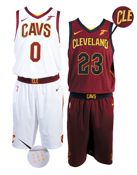
Although many NBA fans are justifiably loath to ads on their team’s jerseys, the Cavs got it right with Goodyear Tire & Rubber Co.’s winged-foot logo. Subtle and perfectly placed on the left shoulder, the winged-foot meshes seamlessly in both design and color. If you aren’t from Northeast Ohio, you may not even know it’s an ad.
Association Uniform
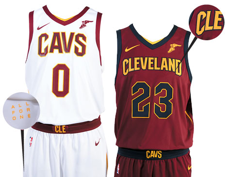
The new white unis, now called the Association edition, with wine lettering and numbers outlined in gold, pop infinitely more than the previous, somewhat bland iteration. Add in the wine Nike check and Goodyear winged-foot, and the Cavs have one of the best Association unis in all the NBA.
“All For One, One For All” Easter Eggs
Including the Cavs’ succinct team motto on the jersey is a creative way to make the new uniforms feel connected to the city they represent. Even cooler? Splitting the phrase in half and hiding both parts underneath different flaps on the shorts. It’s like an NBA Easter egg hunt.

The Bad:
The New Font
The updated font, which spells out “Cavs” and “Cleveland” on the jersey fronts, looks like a typeface you might see on a cheesy Halloween card. The previous font wasn’t perfect, but this feels like Ricky Davis’ wrong-way attempt at a triple-double.
“Cleveland” on the Icon Uniform
Whereas the word “Cavs” on the Association jersey is appropriately sized and perfectly spaced, the “Cleveland” on the Icon edition feels like a 7-footer flying coach. It’s cramped and doesn’t look half as good as it did on last year’s wine jersey. The shorter the team or city name on the front, the better.
Navy Numbers
On the Wine Jersey Replacing the contrasting gold numbers with navy on the darkened wine jersey gives the Icon uniform a dark and muted feel that doesn’t perform well under the eye test. It’s a good thing Austin Carr isn’t judging them or we might hear a familiar “get that weak stuff outta here.”


