A West Coast native and a Midwesterner buy a 100-year-old East Side house in 2015. Thrilled with the historic structure, the husband-and-wife owners, their young teen, senior mom and two dogs move in and live happily ever after. But even a dream home needs some tweaking eventually.
There was nothing wrong per se; it was just time to update. The Shaker Heights homeowner confesses to “liking something every five seconds, from contemporary to classic,” but not liking every element of any style. The owners worked with Claire Barilla, principal designer of Brightwater Interior Design, to help fine-tune the sweet spot where the diverse styles intersected.
Here in Cleveland, most homeowners reach out to a contractor first. But Barilla, who worked with The Beard Group for this project, indicates this is a little bit backward. “Contractors need instructions,” she says. “Go get a design first.”
Working with an architect or a designer is preferable since these professionals are knowledgeable regarding the structure as well as the most suitable materials for a space, especially the kitchen and bath. They know how to utilize finishes for durability, stain resistance and weathering the daily activities of family living.
“We always try to be original to the home while working with the house’s functions and the vision of the client,” Barilla adds. “Homes like these have beautiful character and we designers and architects want to keep that in our projects. Yet at the same time we have to plan for a modern-day lifestyle. Our needs today are not the needs of 100 years ago.”
While the kitchen had been updated around 2005, the current owners wanted something lighter and cleaner-looking while retaining original architectural details. They didn’t go for structural change but instead reconfigured the space by redoing the cabinet layout and adding a bar sink and prep area.
Barilla and the homeowner decided to retain the kitchen’s fireplace and its elegant flanking columns and tall mantel. They agreed to remove the green marble work surfaces, replacing them with white marble, which is both functional and polished.
They removed heavy, decorative millwork to streamline the appearance of the built-ins and added paneling to all the appliances for a uniform look. They also added touches of vintage brass and polished nickel to the new custom cabinets to create the illusion of free-standing furniture.
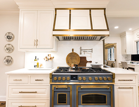
The range, an Officine Gullo stove, is the room’s showpiece and lends an artistic aspect to the kitchen. Crafted from heavy-gauge stainless steel and solid brass, the stove was handmade in Florence, Italy. The homeowner chose the piece herself, settling on a smoky blue finish that contrasts with the warm white cabinets and dark wood floor. With such a centerpiece, there’s no need for an elaborate backsplash or additional embellishment. Instead, the clean, classic lines and layered colors of the counters and cabinets keep the look distinctive and uncluttered.
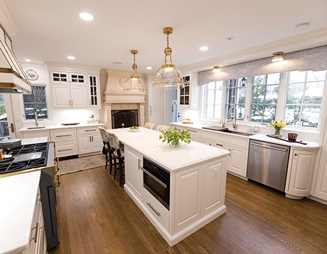
“We wanted to keep the basics neutral and then marry all the elements together in the window treatments and rugs,” says Barrila. “Kitchens tend to be hard spaces so we warmed everything up with alabaster-colored surfaces, the blue from the oven and warm stained wood cabinets.”
This is a working kitchen with the family gathering for meals and the couple entertaining regularly. Reconfiguring it offered better access to the outdoor kitchen and patio through the side door as well as the back door (the original) with its sidelights and transom windows.
Just beyond the work area is a built-in desk, an inviting nook where the homeowner schedules daily tasks and plans meals. Here, as in the rest of the kitchen, Old-World refinement and modern-day sensibilities meld. Behind the burnished façade of the cabinet, a charging drawer keeps family electronics organized but out of sight.
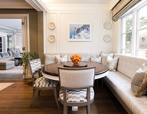
“We just wanted the rooms to reflect us a little bit more,” the homeowner says. “I really appreciated that Claire listened to me and guided us in the direction we wanted to go — we just didn’t know how.”
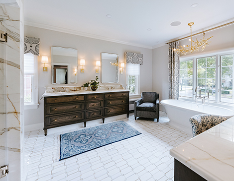
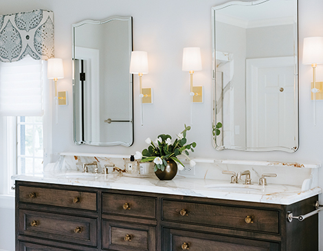
The same governing principles of mixing and matching old and new, the practical and the aesthetic were used in the primary bath as well. And the color scheme is similar with soothing whites, stormy blues and dark wood finishes.
Planning the bath was a balance between the owner’s priorities, the layout and upgrades to plumbing and electrical while also keeping the existing character of the house. For example, the homeowner indicated she wanted to eliminate the look of a lot of grout in the shower, and this was achieved by using bigger porcelain slabs.
The room was reconfigured to accommodate the extra-large shower that has two heads, body jets and a rain shower, but also leaves room for a soaking tub and a double vanity with twin sinks. Again, the bath incorporates a furniture-like piece with texture and glow, rather than a sterile built-in.
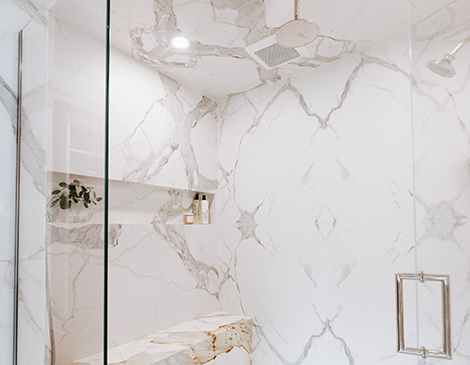
Upgrades to the primary bath left the original tile but brought plumbing and electrical to code and added a heated floor. Gold accents in the lighting fixtures and counter seams add a touch of glamour to the room. The result is a soaring space filled with glowing warmth and an inviting zen-like calm, a true retreat from the outside world.
The homeowner is beyond pleased. “Practicality is a huge thing for me. If a room looks really nice but doesn’t work, I couldn’t live with it. I love these spaces. We use it, all of it, as much as possible.”
“This is how a vision comes to life,” Barilla says. “Professionals bring the elements together in a way a homeowner, even a handy one, cannot.”

