Martin Johannessen has made a living breathing new life into old homes. But when the president of Harmoni Designs and Harmoni Build took on the renovation of a friend’s rental house in Cleveland Heights, even he was surprised by its challenges. Years of renters had left the house with run-down kitchen cabinets, water damage in the bathrooms and seven layers of long-forgotten flooring in the kitchen. Despite all this, the 1920s home had great bones and a good floor plan. Plus, his friends wanted to see their former family home returned to its past glory before selling. “They didn’t want to just throw it on the market and have someone flip it,” he says. “They love the house, and all their friends are still its neighbors.”
Martin Johannessen and his wife, Diana, COO of Harmoni Designs, set out to honor the home’s roots while giving it a fresh, top-to-bottom makeover that would appeal to today’s homebuyers. The result is a clean, bright blend of modern, Scandinavian-inspired design with refinished details including the original staircase, crown molding and hardwood floors. The home sold within weeks of being on the market. “When the old sellers came to see it, they were so pleased,” says Johannessen.
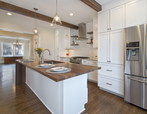
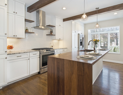
The cramped, dreary kitchen offered little flow to the adjacent rooms. So Johannessen removed the walls between the kitchen, dining room and an office (now a dry bar) for a more open plan. Other modern updates included a white, arabesque-pattern tiled backsplash and a live-edge walnut countertop that matches shelving and two overhead beams. Meanwhile, traditional white Shaker cabinets recall the home’s history. “It’s a style that works well with both traditional and more modern houses,” says Johannessen. “That’s sort of the transition point between the two styles.”
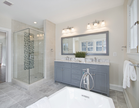
Master Suite
Despite having several bedrooms, the second floor had a single bathroom. So Johannessen created a master suite by converting a 170-square-foot bedroom into a large bathroom and attached it to another bedroom. He built a trendy shiplap headboard by hand for the wall and added a large walk-in closet. But the highlight is the natural-light-filled bathroom, complete with a stand-alone soaking tub and a shower featuring colorful tile in the same shape as the kitchen backsplash. “We always try to tie things together,” he says.
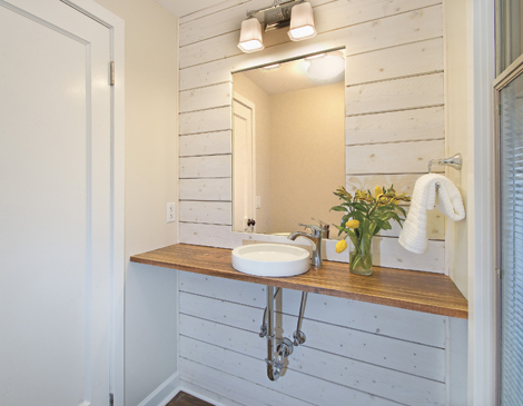
Powder Room
The serene first-floor powder room, once adorned with dark gray carpet on the walls and black vinyl flooring, has a live-edge wood countertop, Mission-style light fixtures and a white shiplap accent wall. “It has sort of a blend of Scandinavian and Japanese design to it,” says Johannessen. “It still has some traditional features, because it has to fit in with the house, but that was definitely a big change."

