Marking 15 years of a vibrant tradition, Sherwin-Williams expands its Color of the Year into a capsule collection showcasing nine varying shades like Rain Cloud, Grounded and White Snow, designed to inspire stunning and versatile combinations.
“After doing a single Color of the Year for the last 15 years, we realized that we wanted to offer consumers something more than just one color. By offering an entire capsule, we realized we could provide options for everybody — homeowners, designers and professional painters alike — to find something that speaks to them and create their own color story,” explains Sue Wadden, director of color marketing at Sherwin-Williams.
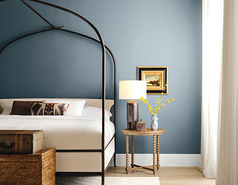
The colors in the capsule feature whites, browns, purples and blues. According to Wadden, the colors chosen are meant to tell a story of both the past and future. The mix of shades represent where the trends are going, while highlighting the most essential colors from Sherwin- Williams’ collection, including picks from the Colormix Forecast, Designer Color Collection and other unexpected shades that the team is excited to see out in the world.
Sign Up to Receive the Cleveland Magazine Daily Newsletter Six Days a Week
“Nostalgia is having a big impact on design, and people are craving those authentic pieces of the past in their homes,” says Wadden. “The capsule feels very eclectic and reminiscent of the 1970s, which is making a comeback in home and design, but we added a few modern shades to keep it feeling fresh and fun.”
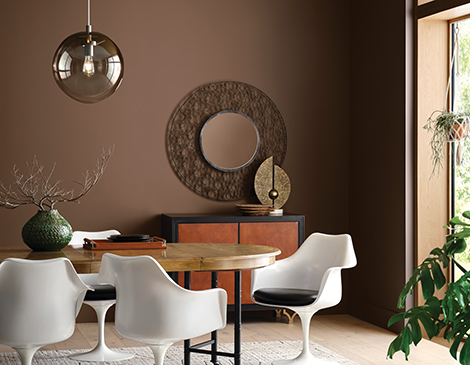
The wide range of color choices in the capsule allow for the hues to be used in every room, every home and for every look.
“For bedrooms, I’d recommend picking one of the dark browns in the capsule, Clove SW 9605 or Grounded SW 6089, to create a dramatic, luxurious yet restorative sanctuary — especially in a master bedroom,” says Wadden. “I’m also biased toward recommending Sunbleached SW 9585 for bedrooms, since it’s currently the color on my bedroom walls. The very modern white from our Designer Color Collection is an airy light neutral that is deeper than white, not quite gray, and ventures beyond beige or taupe.”
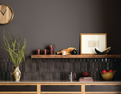
As for the upcoming trends, Wadden suggests that neutrals will remain essential as they provide a grounding element and a backdrop for personal expression. “But we anticipate a growing appetite for bolder, more saturated hues as homeowners and designers look to infuse spaces with individuality,” she further explains.
READ MORE: 6 Interior Trends Entering Cleveland Homes in 2025
With Downtown Cleveland being the home of Sherwin-Williams, and the company’s new skyscraper headquarters having recently finished construction in October, Wadden expressed the impact the city has on the brand’s color marketing.
“Cleveland’s industrial heritage, combined with its vibrant arts scene and natural beauty along Lake Erie, plays a key role in shaping Sherwin-Williams’ approach to color,” Wadden states. “The city embodies a balance of history and innovation, much like our palettes. Its architecture and seasons inspire our deep, grounding neutrals, while its artistic community and revitalized neighborhoods encourage us to explore playful, eclectic shades like Bosc Pear SW 6390.”
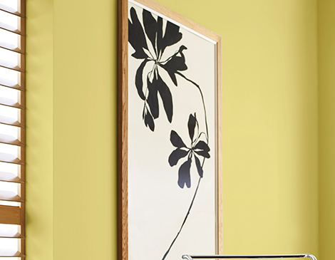
Who knew Cleveland could have such a big impact on painting selections? “While our reach is global, Cleveland’s resilience and creativity are at the heart of our color story,” Wadden says.
The alchemy of the color palette may serve as a creative toolkit for designers, representing their own role in combining the colors with textures, materials and furnishings to create distinctive spaces. According to Wadden, homeowners might see it as an invitation to use the capsule to craft environments that feel personal, meaningful and elevated — like creating their own “magic” at home.
For more updates about Cleveland, sign up for our Cleveland Magazine Daily newsletter, delivered to your inbox six times a week.
Cleveland Magazine is also available in print, publishing 12 times a year with immersive features, helpful guides and beautiful photography and design.


