This Eclectic Cleveland Heights Condo Fits Plenty of Character Inside
by Kate Bigam Kaput | Feb. 24, 2022 | 1:00 PM

Sharon and Tony Hughes
It's not every day that designer Katie Tumino gets to work with a homeowner who has an impeccable sense of style and already owns all the furnishings for a beautifully designed home. Tumino, lead designer at Reflections Interior Design in Cleveland, was thrilled when past clients asked her to help make their new place feel like home.
“The wife has fantastic taste and a great eye for design, and much of her collection is inherited from her parents,” Tumino says. The couple were downsizing into a condo in an eight-unit building in Cleveland Heights. “We wanted to get back to the original feel of the building for a design that was more appropriate for a space built in 1930.”
Courtesy Sharon and Tony Hughes
The problem, though, was the space itself.
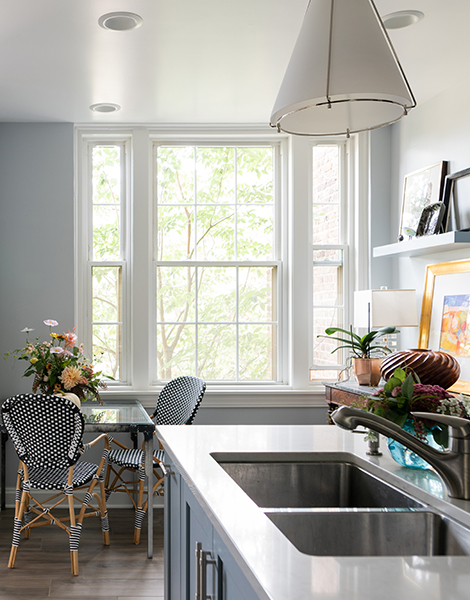
The 2,600-square-foot condo was all tight corners and strange angles with a cramped kitchen made even more congested by the fact that it housed the entire building’s HVAC unit. “It was all very poorly laid out,” Tumino says. “Just a lot of wasted space.”
She completely re-envisioned the area from doorways to cabinetry to furniture placement — and not just in the kitchen.
Courtesy Sharon and Tony Hughes
“My focus was making sure that the layout and the flow of the space not only made sense but was perfectly suited to my clients,” she says.
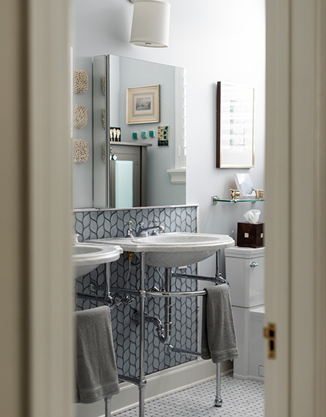
They reconfigured a bathroom that was originally accessible from two bedrooms by closing off one of the doors and blowing out a wall. And she expanded the bathroom itself, stealing space from a bedroom closet to create a walk-in shower with wall-to-wall subway tiling.
“It was like Tetris, figuring out how to make everything function the way they needed it,” Tumino explains.
Renovations were stalled because of the pandemic, but upon their completion, she and the client got to work designing the space. Their goal was to meld the homeowners’ classic taste with modern twists to enliven the space, aiming for a cool bed-and-breakfast vibe over a stuffy museum one.
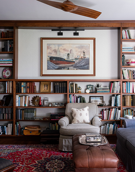
“We brought in some clean, modern lines through cabinetry, fabrics and wallpaper patterns for a little bit of a funky flair,” Tumino says. “But there’s also a lot of nostalgia to her furniture and accessory collection.”
READ MORE: This Medina Home Library Is a Book Lovers' Cozy Dream
Courtesy Sharon and Tony Hughes
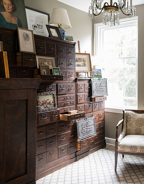
That nostalgia is quite literally on display in the memorabilia room, which is designed around an antique optician’s chest the homeowner inherited. The massive, wooden piece contains dozens of small drawers that now serve as built-in stands for photographs, paintings and other vintage curiosities. Meanwhile, neutral-toned, sunburst-patterned upholstery brings a bit of contemporary levity to the room.
“With all the dark furniture, we made sure to throw in some fun fabrics to put a fresh take on things and bring out the beautiful lines of these heirloom pieces,” Tumino says.
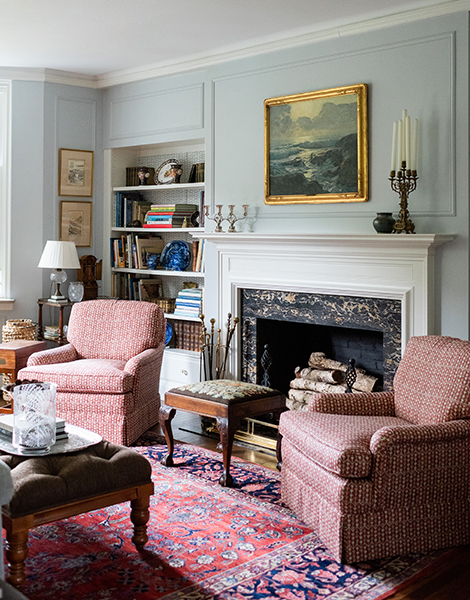
That theme continues throughout the home. In the dining room, Tumino refinished the couple’s dining table and turned an upholstered bench into banquette seating by cutting down its legs (to get it to the proper height). Where the table is dark, the banquette is light; where the Oriental rug is classic, the rest of the fabrics are light and even playful, with a squiggly-print pillow and a tiered lighting fixture made of rattan.
Courtesy Sharon and Tony Hughes
A boldly patterned William Morris wallpaper in shades of black and brown covers one large wall panel, like a piece of built-in artwork on display.
“We didn’t want it to overpower and take over the rest of the room, so we stayed with earthy colors,” Tumino explains. And although neutrals abide, a steely bluish gray color is one of a few repeating elements throughout the house that gives it all a subtle consistency.
Rattan, too, appears more than once, both in the distinctive chandelier and in the doors of the bedroom closets. The overall effect is a cohesive space that feels tranquil and curated without being obvious or overly matchy.
READ MORE: Local Amish Furniture Maker Caught the Attention of The Metropolitan Museum of Art
Courtesy Sharon and Tony Hughes
And while the large-scale architectural overhaul could only have been envisioned by a professional, Tumino says the interior decorating was done in close cooperation with the homeowners, whose aesthetic and existing possessions drove the direction of the project.
“We felt that it was very successful in the end,” Tumino says, “and I think the results speak for themselves.”
Get inspired by our 2022 Home Issue with these decorating tips, local home spotlights and more.
For more updates about Cleveland, sign up for our Cleveland Magazine Daily newsletter, delivered to your inbox six times a week.
Cleveland Magazine is also available in print, publishing 12 times a year with immersive features, helpful guides and beautiful photography and design.
Trending
-
1
-
2
-
3
-
4
-
5


