Danielle DeBoe Harper fancies herself something of a nomad. In the past 13 years, the owner of interior decorating firm DeBoe Studio has lived in 15 places — most recently in an 1,100-square-foot, two bedroom loft in Tremont with her architect husband Wes Harper and their 2-year old daughter, Penny.
“I just never really viewed where I was living as a fixed thing,” she explains. “I use the places I live as a palette to express my creativity — and then I move on.”
They had talked about someday building a home in Ohio City. (Wes is the co-founder of Horton Harper Architects, which specializes in urban residential design.) But at 10-months-old, Penny started walking. “Suddenly our loft became really small,” Danielle says.
As designers, the aesthetics of their future house was very important. But they didn’t totally agree on style. “I like more of the old historic elements,” Danielle says.
Wes, however, gravitates more toward contemporary styles. “I appreciate good detailing, and good use of material, but I don’t think something’s cool just because it’s old,” he explains. They told their real estate agent they wanted a place that “married the clean contemporary aesthetic with the historic look,” Danielle says.
In February 2016, Danielle was scrolling through listings, when she found herself looking at a 1928 lavender gray center stair colonial. “I said, ‘Oh my God, this is our house,’ ” Danielle recalls of the 1,900-square-foot dwelling.
Walking inside the first time, the house already felt like home. “When I looked at the design choices and elements, I felt like we could totally be friends with the owner,” Danielle explains.
Their bid was placed — and accepted — that day.
Last April, the family moved in and immediately began placing their stamp on the home. Danielle refers to the duo’s decorating style as “down-to-earth drama.” That philosophy is represented in everything from wallpaper choices to furniture and rugs.
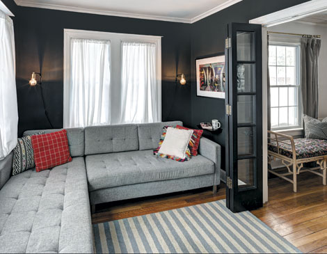
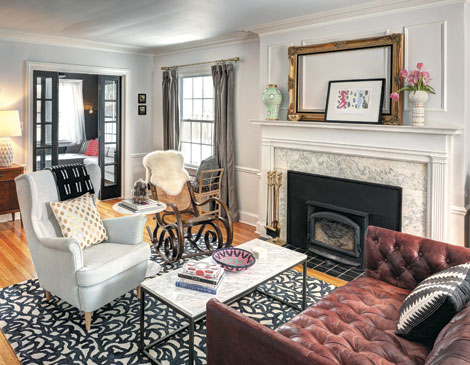
The living room, for instance, features lush, charcoal velvet curtains from West Elm, held back by antique-looking brass rings. Above the fireplace, a black-framed colorful Henri Matisse print leans against a much larger antique gilded frame she bought from Gray’s Auctioneers. “It feels so fresh and fun and poppy, juxtaposed next to the fussiness of the frame,” Danielle explains.
Unlike many American homes, the furniture in the Harpers’ living room is not arranged around the placement of a television. Instead the furniture becomes the focal point of the space.
“We wanted to arrange the furniture in a way that inspires conversation,” Danielle says.
The couple loves bold splashes. Danielle, for a long time, for instance, was intent on putting up black-and-white graphic print wallpaper on the dining room walls. She backed off, however, when she realized the pattern would close in the dining room and decided to go with a more muted ivory ticking striped pattern from Wayfair.
The duo kept the classic theme going with a simple black rectangular Parsons table. But they wanted a touch of theater in the room. So instead of going with a traditional chandelier, the couple chose a West Elm geometric-shaped, midcentury modern piece with clear acrylic tubing, capped by brass balls.
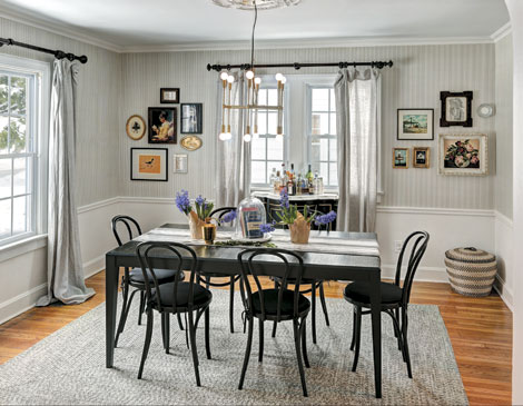
“It gives the room a sense of whimsy,” Danielle says.
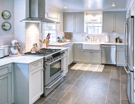
While it was the kitchen that originally attracted the Harpers to the house, they ultimately found that it’s all-white state was a little too sterile for their taste. So they painted the cabinets a light gray and added gold hardware and a gold faucet.
“[The accessories] keep the kitchen from being too casual and too farmhouse,” Danielle explains.
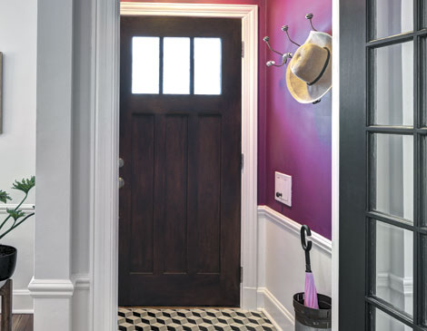
The rest of their house is anything but pedestrian. The couple’s front entryway is painted a bright berry with a tiled floor in a black-and-white geometric checkerboard style from The Cement Tile Shop.
Upstairs, they painted the lower half of the walls in Penny’s playroom with chalkboard paint, so she could go wild. Penny’s room itself is a love letter to France. (Danielle is a bit of a Francophile.) It features a black turned-spindle crib from BuyBuy Baby, framed black-and-white photos Danielle took when she was in France, and a pink record player that’s on constant rotation.
“I have this one called I Love Paris,” Danielle says. “Every time I turn it on, Penny runs in from whatever room she’s in and says, ‘Mama, dance.’ ”
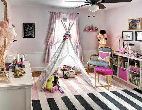
Penny’s room, along with many rooms in the house sport one of Wes’ favorite architectural features: decorative chair rail moldings lining the walls. But he was bothered by the fact that the molding did not extend into the common areas.
“I’m really concerned about transitions,” he explains. To make the rooms feel more connected, the couple hired a contractor to re-create the design pattern and lengthen the railings out into the hallways.
“It just gives it a more elegant treatment,” Danielle explains.
The art on the wall throughout the house is an eclectic, ever-changing mix. In the living room, a framed needlepoint Wes’ grandmother crocheted of the United States sits kitty-corner from a large over-sized modernist picture of an airplane that Danielle recently bought online.
She likes the arrangement for now but says they might change it up shortly. It’s a bargain she’s made with Wes. “I can’t just upend my family every time I get an itch anymore,” she laughs. “But at least I can keep the wall decor transient.”
Get the Look
Danielle DeBoe Harper spent months scouring the Internet for this bentwood cane seat rocker, which features a woven bottom and back, before lucking out and finding one on a tree lawn in her new neighborhood. “It’s a timeless style,” she explains. “It looks particularly good paired with clean lines and modern furniture.” While similar versions of the chair are available on Wayfair or can be found at estate sales, she says a regular all-wooden rocking chair can achieve the same timeless look.
Now This Is How You Freshen Up An Older Home
This Shaker Heights colonial is a canvas for design that mixes history, flair and a bit of Paris.
at home
9:00 AM EST
March 8, 2017

