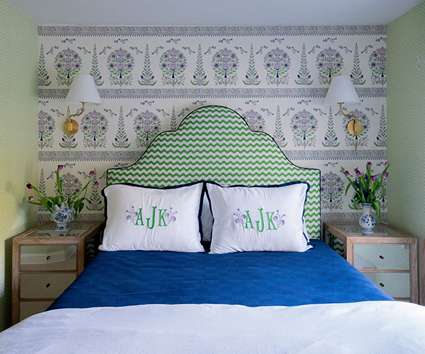
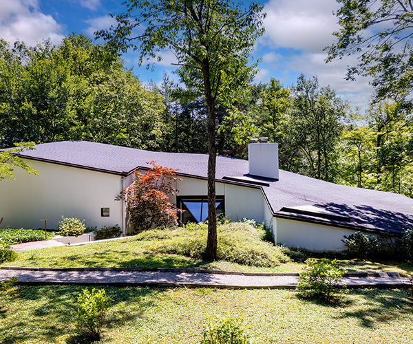
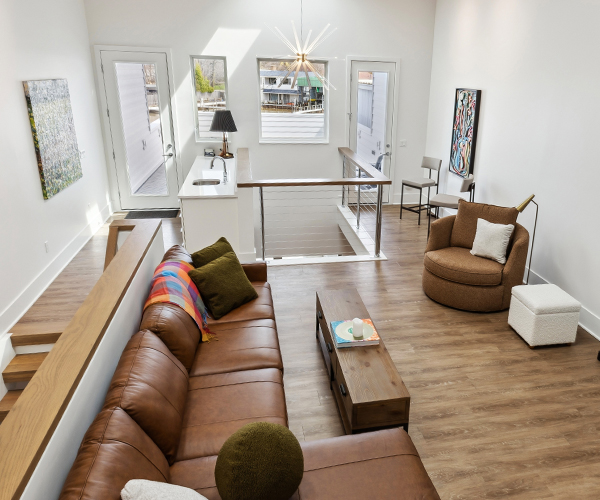
Sean Carter had worked in lots of colors during his time at an interior design firm Sapphire Pear in Rocky River. But nothing had prepared him for what his husband-and-wife clients wanted in the primary-suite bath of their midcentury Rocky River Cape Cod. They conveyed their desires for the room — a utilitarian light-blue space with an acrylic stall shower and two sinks dropped into a laminate-topped wooden vanity — by showing him the wallpaper they used to wrap a third-floor office, a bold flower-and-dragon pattern executed in brilliant hues.
“Some people say they love color, but it’s always a question of, 'Well, how much color do you actually like?'” he says. “For them, it was just, like, the sky’s the limit. There were no boundaries.”
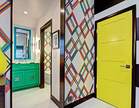
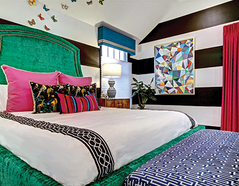
Inspiration for an eye-popping palette dominated by fuchsia, emerald green and deep pool blue came from the geometric pattern in a pricey Pierre Frey wallpaper, which Carter interpreted for the primary bedroom in a more affordable custom design printed on white grasscloth by manufacturer Phillip Jeffries. He then turned his attention to the task of skillfully combining a crayon box’s worth of color in one space.
(Photo courtesy Still Capture Photography)
“It was definitely challenging to figure out how to incorporate all these colors without looking like a clown house,” he says, particularly given the clients’ design goal. “They really wanted a luxurious space that reminded them of a hotel. Once they entered the door, it was their own private oasis.”
Carter began by creating a pure-as-the-driven-snow backdrop in the bath, where contractors had removed a wall separating it from a walk-in closet — a necessity replaced by a built-in bedroom wardrobe cabinet — to add square footage. He then constructed a water closet for the commode, and relocated the entrances from the bedroom to the bath and the former closet to symmetrical locations on one wall. He covered that wall in a white porcelain tile striated in white and gray and finished the floor and two facing walls of the newly created 8-by-4-foot shower in a plain white porcelain counterpart. The latter was the perfect foil for a back shower wall tiled in a mosaic of handmade trapezoidal tiles in everything from orange to teal to lime green, some custom colored.
“[The tile company] didn’t have a pink that was quite right,” he says. “It took a lot of going back and forth.”
(Photo courtesy Still Capture Photography)
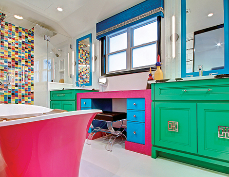
Carter outfitted one long wall with custom his-and-hers vanities separated by a makeup table, an amenity conveniently illuminated by natural light from an overhead window. “[The vanities] just gravitated towards green,” he says of the emerald semi-gloss used to paint them. The makeup table, in contrast, was covered in a fuchsia laminate. It’s more durable for nail-polish remover, beauty products and stuff,” he says. “It holds up better than a stone would. And there’s no such thing as a fuchsia natural stone or quartz.”
Carter topped the vanities with white quartz boldly veined in black and gray, like that in the wall tile, and framed the mirrors in the same contrasting deep pool blue used to paint the makeup-table drawers and cover a window valance in chenille. “I just wanted to bring some symmetry and balance to the space,” he says. Asian-inspired, polished-nickel hardware serves as visual ties to design elements in the bedroom, all visible through aforementioned entrances left without doors to enhance the look and feel of a fresh, fun hotel suite.
“The acrylic pulls also pull from [the clients’] bedroom — they have a bench in their bedroom that has acrylic legs,” he explains. That bench, he adds, prompted the addition of a makeup-table stool consisting of an acrylic frame and seat upholstered in black, a striking neutral used to paint door and window frames and trim the valance in a Greek key pattern.
(Photo courtesy Still Capture Photography)
The focal point in a room of focal points is arguably the Victoria + Albert freestanding tub installed between the two entrances from the bedroom. Carter notes it is made of volcanic limestone that is milled and mixed with resins. “It holds heat very well,” he says. “So the water stays warm for a very long time.” The feature, the exterior of which was custom-finished in the same fuchsia as the makeup table, is filled by a wall-mounted tub-filler and lit by a futuristic Hinkley Lighting fixture consisting of an LED-illuminated panel suspended in a black frame.
While every shade of every color was carefully selected and placed, the bright yellow used to paint the door of the water closet housing the commode — where one wall was covered in the same paper Carter created for the bedroom — was a last-minute decision. When Carter fanned out his rainbow of sample cards and asked his clients to select one for the door, they turned to their 4-year-old son and asked him to choose. There are no regrets. Carter reports that they love the result, a literal bright spot in, with the exception of the office, “a lot of gray walls” broken by little pops of navy.
“Eventually,” he says, “we will be working on the rest of the house.”
Get ahead of the weekend by signing up for our free weekly “In the CLE” newsletter — your guide to fun throughout The Land. Arriving in your inbox every Wednesday, this weekend to-do list fills you in on everything from concerts to museum exhibits — and more. Click here to subscribe.


