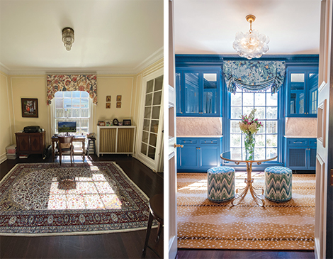
No one knows exactly how the architect of the 1928 neo-Georgian intended the tiny first-floor room to be used. But the current owners of the 5,000-square-foot Shaker Heights residence saw it as an early 20th-century version of the bonus room, one they turned into a study for their four children. The 14-by-12-foot space was near the kitchen, a location that made it easy for the couple to watch as the kids did their homework. The children, however, gradually migrated to their bedrooms to do their assignments. By the time the oldest went to college, it was obvious that the room needed a refresh, particularly after Shaker Interiors founder and principal designer Nikki Pulver and general contractor/partner Gerald Kazmir finished redecorating the neighboring family and living rooms.
“[The clients] love to entertain, with the size of their family,” Pulver says. “And with the nature of where this is located in the house, it just was such a natural space for a bar.”
(Courtesy Stephanie Penick)
The conversion presented obstacles that could drive a designer to drink.
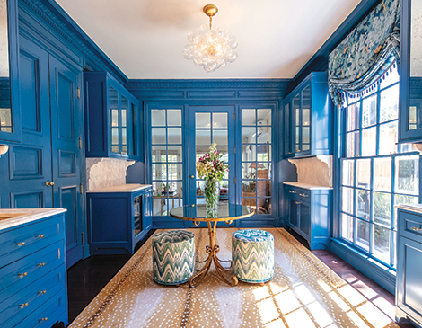
Just painting the room took a month. Painters applied six coats of cerulean, a deeper shade of blue incorporated in the family and living room decors that gave the bar a moodier, sexier feel. The task required sanding the walls after each coat dried.
“To do a high-gloss wall treatment, you need the walls so smooth,” Pulver says. “Otherwise, with the gloss, they project every imperfection.”
(Courtesy Stephanie Penick)
READ MORE: This Solon Basement Proves Entertainment a Whole Family Can Enjoy
More vexing was installing the cabinetry needed for storing glasses, barware and liquor — it was complicated by a large window and a radiator on one wall and sets of double doors on all the others. Pulver managed to tuck an abbreviated bank in each corner of the room.
One under-counter stretch cleverly conceals a new radiator behind doors with front grilles. The cabinets on the other side of the window are just as shallow. “Because of the door swings, we couldn’t give them full depth,” Pulver says.
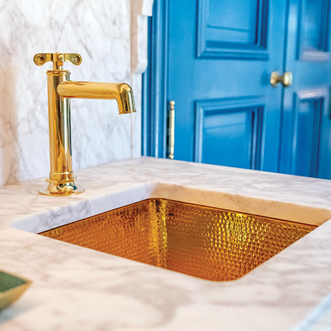
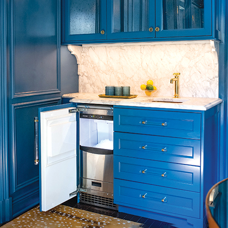
Notches in the standard-size lower counterparts on the interior wall allow doors to open all the way to the walls. One houses a Sub-Zero beverage center, refrigerator drawer and pull-out trash receptacle, the other a square hammered-brass sink and Scotsman ice machine that produces a specific type requested by the man of the house.
“He said, ‘If we’re doing this as a bar, all I want is nugget ice like I can get at Chik-fil-A,’” Pulver says.
The cabinetry, like the walls, were painted cerulean and topped with a honed Carrara marble that offsets the shine of high-gloss paint and antique-mirror door fronts added to “bounce the light around,” as Pulver puts it. The material was also used for backsplashes and corbels that appear to support overhead cabinets.
(Courtesy Stephanie Penick)
“We just didn’t want to do polished marble,” she says. “I just thought it would start looking like Vegas.”
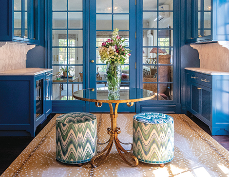
Pulver ordered the original brass door hardware replated, a finish repeated on the hardware of a Visual Comfort light fixture composed of bubble-like glass globes. She outfitted the window in a deep blue-and-green verdure-patterned London shade trimmed in beaded fringe and covered the floor with an antelope-patterned wool carpet. Furnishings were limited to an antique-mirror-topped brass table flanked by two stools upholstered in a blue-, green-and-cream flame stitch.
“We kept the middle of the room open for traffic,” Pulver says. “Even though there is that center table, it is very easy to get through.”
Pulver credits her clients with showing the patience necessary for contractors to execute her vision for the room. She concedes that it is the most difficult project, inch per inch, that she and Kazmir have tackled.
“But it was worth it,” she declares. “It’s our little jewel box.”
READ MORE: How a Detroit-Shoreway Resident Fills Her Home With Energy
(Courtesy Stephanie Penick)
For more updates about Cleveland, sign up for our Cleveland Magazine Daily newsletter, delivered to your inbox six times a week.
Cleveland Magazine is also available in print, publishing 12 times a year with immersive features, helpful guides and beautiful photography and design.

