Updating A 1910s Gates Mills Home
by Marisa Palmieri Shugrue | Dec. 4, 2019 | 1:00 PM

Tiffany Moroscak of Mabry Design Interiors selected the colors, furniture and decor. “The homeowners have strong East Coast ties,” says architect George Clemens. “They were going for elegant with a little coastal flair, but they really just wanted a beautiful, updated look.” The Center-Hall Georgian home was designed by Walker and Weeks, the architects behind Severance Hall, the Federal Reserve Bank of Cleveland, Cleveland Public Library and Cleveland Municipal Stadium.
They also designed many residences in Cleveland Heights and Shaker Heights, as well as rural Gates Mills retreats, such as this one. “We found the home offered so many beautiful details, so our job was to complement them and create an incredibly convenient space for modern living,” Clemens says.

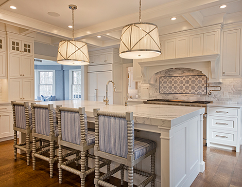
Modern Kitchen: Like many upper-middle-class homes of the era, the kitchen and its adjacent rooms were designed for servants, not families. Modernizing these spaces means a complete overhaul. “The big trick is making a gracious, beautiful kitchen now that it has become one of the major living spaces in the home,” Clemens says. “The soft seating nook, which used to be a small dining area, gives connectivity to the kitchen. The kids can do homework there while being connected to whoever’s in the kitchen.”

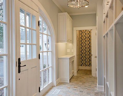
Mudroom: The mudroom breezeway, the family’s primary entry to the home, boasts a nearly floor-to-ceiling elliptical side entranceway. A bathroom was added off the breezeway, allowing another first-floor restroom to serve as a formal powder room. The mudroom’s white cabinetwork mirrors the kitchen’s and provides plenty of space to stow shoes, backpacks, coats and other daily clutter. “The mudroom is down a step, so all the shoes and stuff stay in the mudroom and nothing comes into the kitchen,” Clemens adds.

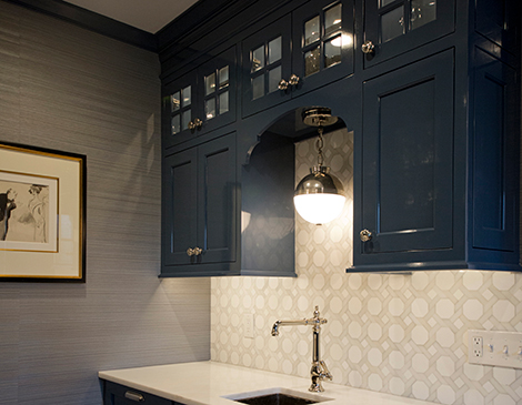
Butler's Pantry: At the request of the homeowners, the service room combines a classic butler’s pantry functionality with the capability of a full bar. The space connects the formal dining room with the kitchen by way of an original pivot door. It’s equipped with a wet bar, integrated wine storage and a paneled dishwasher that blends into the dark blue cabinetry and trim. “They wanted it to be a complete entertaining center,” Clemens says.

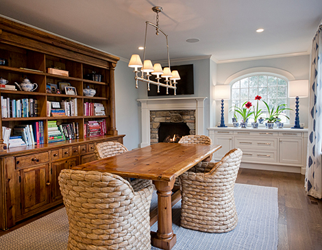
Dining Area: The casual dining area’s new arched window mimics the mudroom’s elliptical entryway while providing a visual endpoint from the kitchen. The built-in buffet complements the mantel from the original stone fireplace and takes cues from the home’s formal rooms. “We’re not using stock trim,” Clemens says. “We’re taking details from those formal rooms and using them just as successfully and elegantly here.”
Trending
-
1
-
2
-
3
-
4
-
5


