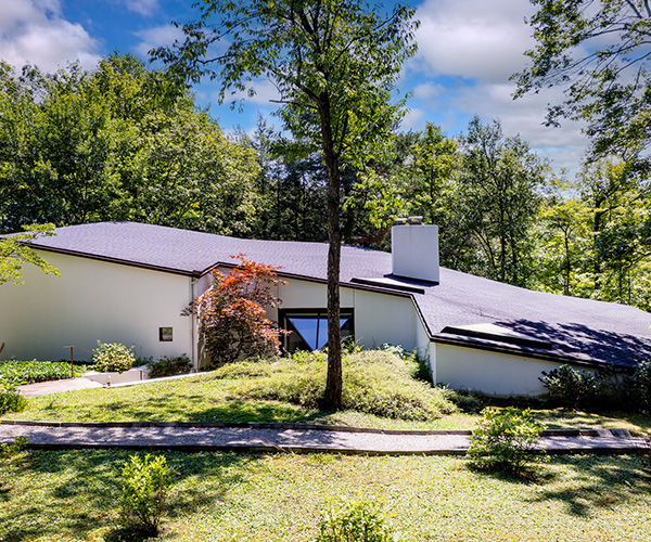
Not many homes need a steel bridge to get to the front door. But Lynn Gorman's Akron house is anything but your typical space.
The property — once a deep ravine — seemed impossible to build on, until architect Joseph Matava figured out how to suspend the dwelling above the landscape as if it were afloat.
A waterfall, which can be seen and heard from almost every vantage point inside, flows under the middle of the structure into a backyard pond, setting the tone for the rest of the space. "When you look at this house, it's about weaving it into the site and creating interior and exterior spaces that amplify the trees," says Matava, design principal at Peninsula Architects.
Though Gorman's abode stands at approximately 6,000 square feet and many of the homes being built today tend to be much smaller, Matava's philosophy meshes with a trend of blending spaces into surroundings instead of standing out.
"Houses should offer people the opportunity to experience their property," says Matava. "It should create a relationship between the built environment and the natural environment."
In Gorman's backyard, for example, a ground-level deck incorporates a heated floor so she has easy access to an infinity hot tub even during the winter. Gorman uses part of her second-floor deck off the kitchen as a garden. But the showstopper of that space is a table and stools made of jade.
Gorman's sister helped her select these unusual pieces at a rock show in Arizona while the place was being built in 2009. "I can't even lift one of those stools," she says. "I just knew my house was the perfect place for it, and I didn't even think about how we were going to get it up here."
Matava had to call the structural engineer to makes sure the deck could support its weight (the tabletop alone weighs close to 1,000 pounds) and a crane was needed to lift each piece into place.
Gorman can easily view the masterpiece from her open kitchen built with soft-close cherry cabinets, a marble island (where Gorman spends most of her time), a lounge area with two comfy chairs and a TV built into a lighted onyx wall that can swing open to the family room. "You can change the space so you can't see the kitchen from the family room," she says Gorman.
The space functions well when Gorman's three daughters and three grandsons visit.
They're also drawn to the theater room, decorated with film reels capturing screen shots of various movies and two rows of plush leather theater seats. "I had everyone pick a favorite movie," she says. "I like The Sound of Music and To Kill a Mockingbird."
The fun continues in what Gorman dubs the Vegas room. It's filled with everything you'd see in a casino, including a stet and poker table. A rock mosaic water feature that doubles as a fireplace was inspired by one she saw at MGM Grand Detroit.
Although this isn't her first time building a house (her previous home occupied 5 acres in Bath), Gorman says, it is definitely her favorite and fits her lifestyle.
"It's warm. This house is welcoming and it's not over-the-top," she says. "People feel comfortable when they come in."
Modern Thinking
Building new digs requires a lot of decisions. To achieve a personalized, well-designed look, use these tips from Joseph Matava, design principal at Peninsula Architects.
RELATIONSHIPS. Consider the connection between the house and the landscape. An example would be to use existing trees to create a natural wall. "Think about how the garage or the lean of the house can move forward or move backward to create a space," Matava says. "Use basic elements to create a soft enclosure."
ORIENTATION. Before you break ground, consider which angle or placement will suit you best — especially when it comes to the sun and your main living spaces, which should face south, east or west. "A lot of times people buy houses from books and they just drop them on properties," he says. "There's no thought process."
DETAILS. "What story can you tell with a detail?" asks Matava. "Use whatever opportunities you have to carry out your theme." On the bridge in Gorman's home, a steel drop cap wasn't really needed, but it added visual strength. "You start with the big global view of the site and how things fit in, but those same thought processes go down to the smallest detail."


