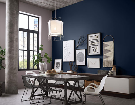
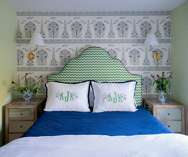
We’re calling it: The gray and white that’s dominated walls everywhere for years has a serious contender in Naval, the Sherwin-Williams 2020 Color of the Year. A saturated navy with a touch of sparkle that evokes the night sky, the hue is inspired as much by the striking art deco vibes of the 1920s as it is by nature and wellness — all big trends in interior design.
“We’re seeing a richer exploration of darker colors everywhere,” says Sue Wadden, director of color marketing at Sherwin-Williams. “Blues were becoming more and more important.” So perhaps it’s hardly a surprise that shortly after Sherwin-Williams made its announcement about Naval last September, Pantone announced Classic Blue as its own Color of the Year.
Naval works with classic Cleveland architecture as easily as new construction, says Wadden, and that century-spanning appeal is its biggest attribute. “What I love most about this color is it is really versatile,” says Wadden. “Whether you’re painting a wall, bringing in design accents or painting your kitchen cabinets this color, it’s just a really usable, timeless blue.”
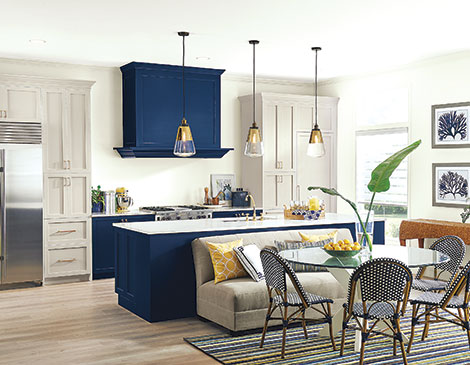
Naval 3 Ways: Ready to bring the Color of the Year into your own home? Here are three inspiring ways to do it.
Cabinets
Wadden has seen an increase in navy-painted kitchen cabinets in interior design and particularly loves it used in “tuxedo painting.” The trend involves using a lighter color on the top cabinets and a darker color, like navy, on the bottom or on an island to create a two-toned tuxedo effect. “Using that on surfaces like cabinetry is a really unique way to use navy blue,” she says.
Front Door
Naval isn’t just for interiors. Wadden suggests using it as an eye-catching alternative to painting a door black or red. Not only is a navy door an instant boost to curb appeal, it’s an easy DIY for most homeowners. “It’s still going to always be classic,” says Wadden. “Navy always goes with a gray and white or a beige and white color scheme on an exterior.”
Walls
If you’re not ready to commit to an entire room, the easiest way to use Naval is on an accent wall. Wadden recommends contrasting it against a mostly neutral room to add a subtle pop of color or even using it to paint the ceiling of a child’s room, evoking a starry night sky. But don’t be afraid of the color’s moodiness. “There’s a little sparkle in the undertone,” she says. “It’s not a drab navy, it’s a really, really pretty navy.”
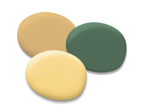
Match Maker: Pair Naval with these colors for a perfect combo.
Kale Green
Pairing this organic green with Naval’s celestial blue is universally attractive. “We all love blues and greens for the simple reason that they’re nature colors,” says Wadden.
Midday
Bright yellow introduces warmth to a room painted in Naval’s cool tones. Wadden particularly likes a more vibrant feel. “I love taking Naval and pairing it with a jewel tone to kind of live bolder,” she says.
Tarnished Trumpet
A glittering gold like this brightens Naval, particularly when used in an accessory, such as a framed mirror or cabinet hardware. “That golden hue balances with the deep richness of navy,” says Wadden.

