The 1950s Pepper Pike colonial was definitely a fixer-upper, a hodgepodge of interiors installed over the decades. Most of Dawn Cook’s clients would have begun a whole-house renovation in the outdated kitchen or the first-floor living areas. But the new owners decided to start in the 800-square-foot owner’s suite. The thirty-something husband-and-wife dentists had moved back to Cleveland from Chicago to take over a family practice. The busy professionals wanted — needed — a private retreat where they could end each day and begin the next in comfort and style.
“They wanted a very curated, bespoke space that represented what they were looking for but also felt very relaxing,” says Cook of Shaker Heights’ Dawn Cook Design/BLDC design.
Cook responded by creating a space that was restful but far from yawn-inducing.
(Courtesy Suzuran Photography)
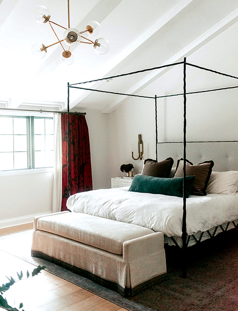
One of her first moves was to work with contractors to raise the bedroom ceiling into the attic. “That really opened up the space, made it more airy,” she says. The result soared from 8 feet at one end to 15 feet at the other, a change that accommodated a contemporary brass chandelier and an updated version of a wrought-iron four-post bed.
Like so many of Cook’s clients, the owners gravitated to a design consisting of light floors and walls that showcase colored window treatments, upholstery, artwork and accessories. Cook ordered the walls painted white and the floors finished in French white oak, warmed by a damask-patterned area rug in shades of taupe.
“[The pile] is sheared really low, so it has an antique quality to it,” she says. She then added “jewel tones and jewelry-[like] details.”
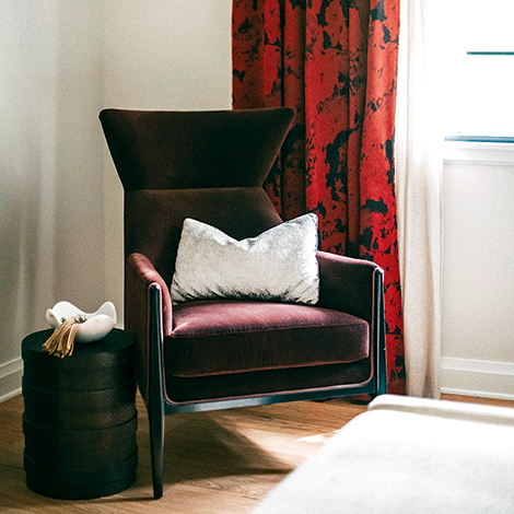
Inspiration came from a garnet-red, abstract-floral-patterned silk used to make the drapery panels.
“I just knew that it would just pop off of the white walls,” Cook says of the fabric.
The rich red shade was repeated in the velvet covering a contemporary wing chair, and the velvet in sapphire trim on taupe mohair accent pillows that, like the drapery panels, “pop off” their white background — in this case, bedding. The custom oatmeal-colored bench at the end of the bed, lavishly trimmed in metallic beading, appears to be covered in velvet, too. But it’s actually a performance fabric.
(Courtesy Suzuran Photography)
“We knew the dogs would be sleeping on it, jumping on it,” Cook says. The linen-textured, black-resin dresser serves more as a place to house components for the television hanging above it than wardrobe storage.
“When you build out the closet so custom, you don’t really need any furniture for your clothes,” Cook notes.
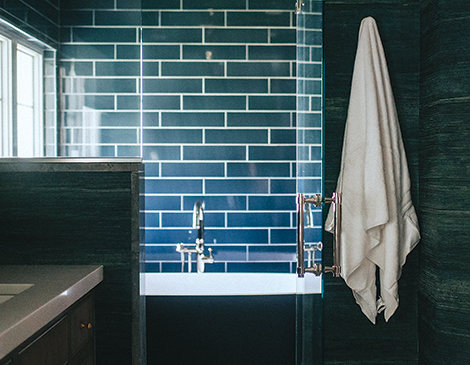
Contractors created the bigger bathroom the couple desired by expanding it into a portion of an adjacent counterpart. Cook’s design called for a wet room, a newer feature in which the tub and shower are glass-enclosed in one area. “We’ve done quite a few in these older homes where we’re reworking to gain space,” she says. The decor is representative of another trend: saturating the entire bathroom in color. The wet room was tiled in a deep indigo porcelain, the balance of the walls was papered in a matching shade of vinyl wall-covering that approximates the look and feel of grass cloth. Even the exterior of the soaking tub is the same dramatic shade of blue.
“There are a lot of tubs now that you can custom color to be any Benjamin Moore paint color,” she notes.
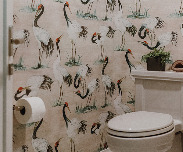
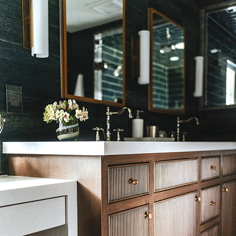
The white that remains the color of choice in so many bathrooms was relegated to the porcelain tile on the floor, quartz topping the floating makeup table and custom chocolate-stained vanity, and the background of a whimsical crane-print wallpaper hung in the enlarged water closet.
READ MORE: Fall Decor To (Pumpkin) Spice Up Your Cleveland Home This Upcoming Season
(Courtesy Suzuran Photography)
“We wanted to just add a touch of whimsy to the design,” Cook says of the last. “And this crane wallpaper just seemed very fun, but still elegant.”
It also pulled together all the colors used in the bedroom and bath.
Cook points out reeded doors that “add an architectural feature” to the vanity, a detail repeated on the nickel door handles. She liberally mixed brass with polished nickel hardware, plumbing fixtures and lighting, which she likens to mixing gold and silver jewelry. But hot and cold shower faucet handles and diverters to direct water to the wall-mounted showerhead, ceiling-mounted rain showerhead and hand-held personal shower are run by a single control panel.
“We’ve been putting those in more frequently,” she says. “You invest in all this beautiful tile, and you don’t want to have a bunch of holes in your wall.”
Cook believes the couple will be able to live with the sumptuous, sophisticated decor in the bedroom and bath as their tastes and lives change. They love the use of color, the contrast of light and dark in the suite.
“It’s something that they won’t get tired of over time,” she says.
(Courtesy Suzuran Photography)
READ MORE: How To Decorate Your Home On A Budget In 2023
Start your day the best way by signing up for our free daily newsletter. Arriving in your inbox every morning to keep you in the loop on the best guides, home and style tips, and news briefs for all things Cleveland. Click here to subscribe.

